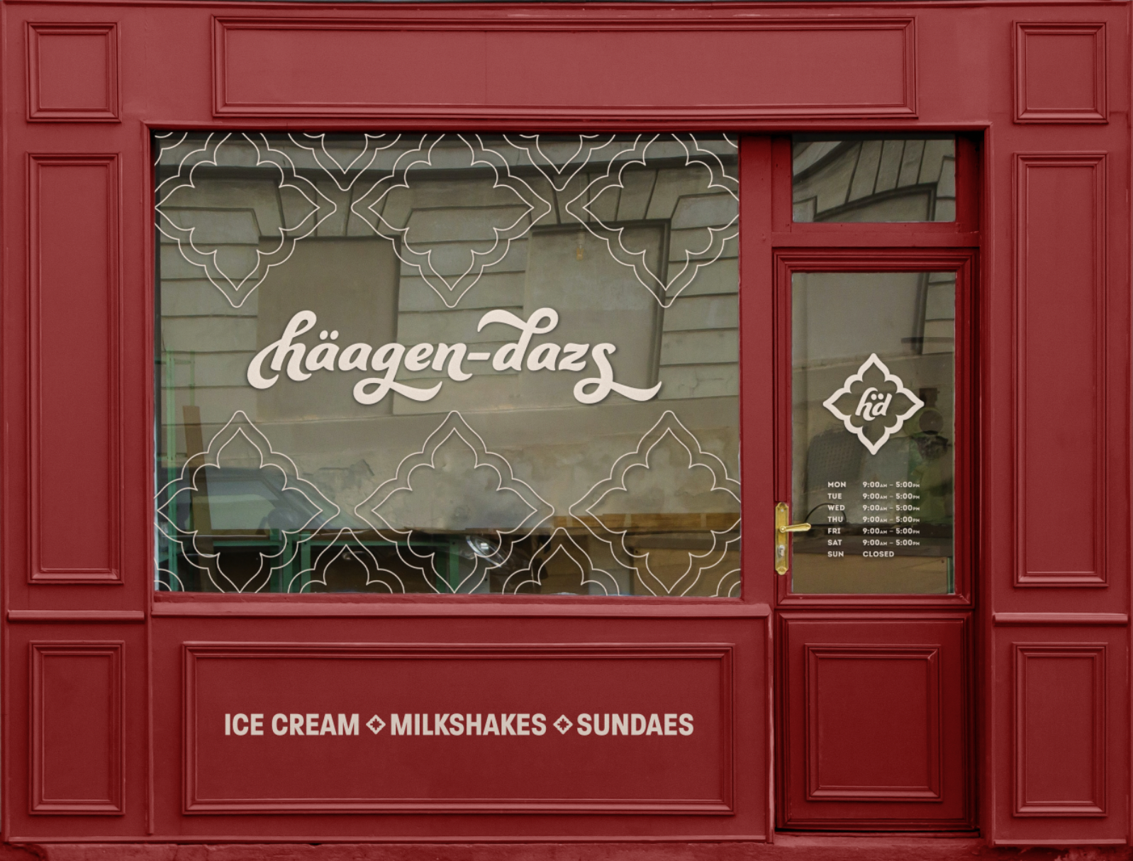
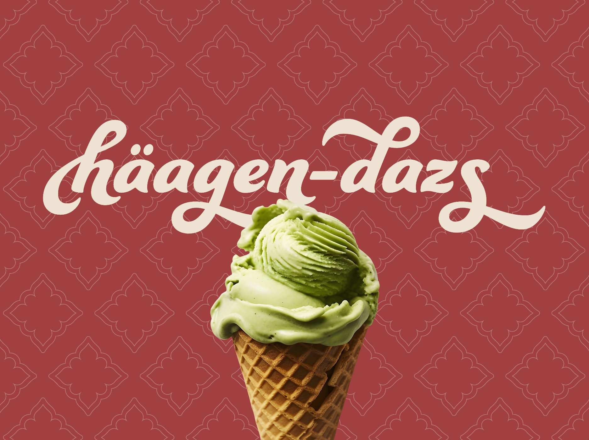
This redesign aims to appeal to a larger adult audience, as Häagen-Dazs showcases flavors that appeal to a more mature taste, for example their spirits collections.
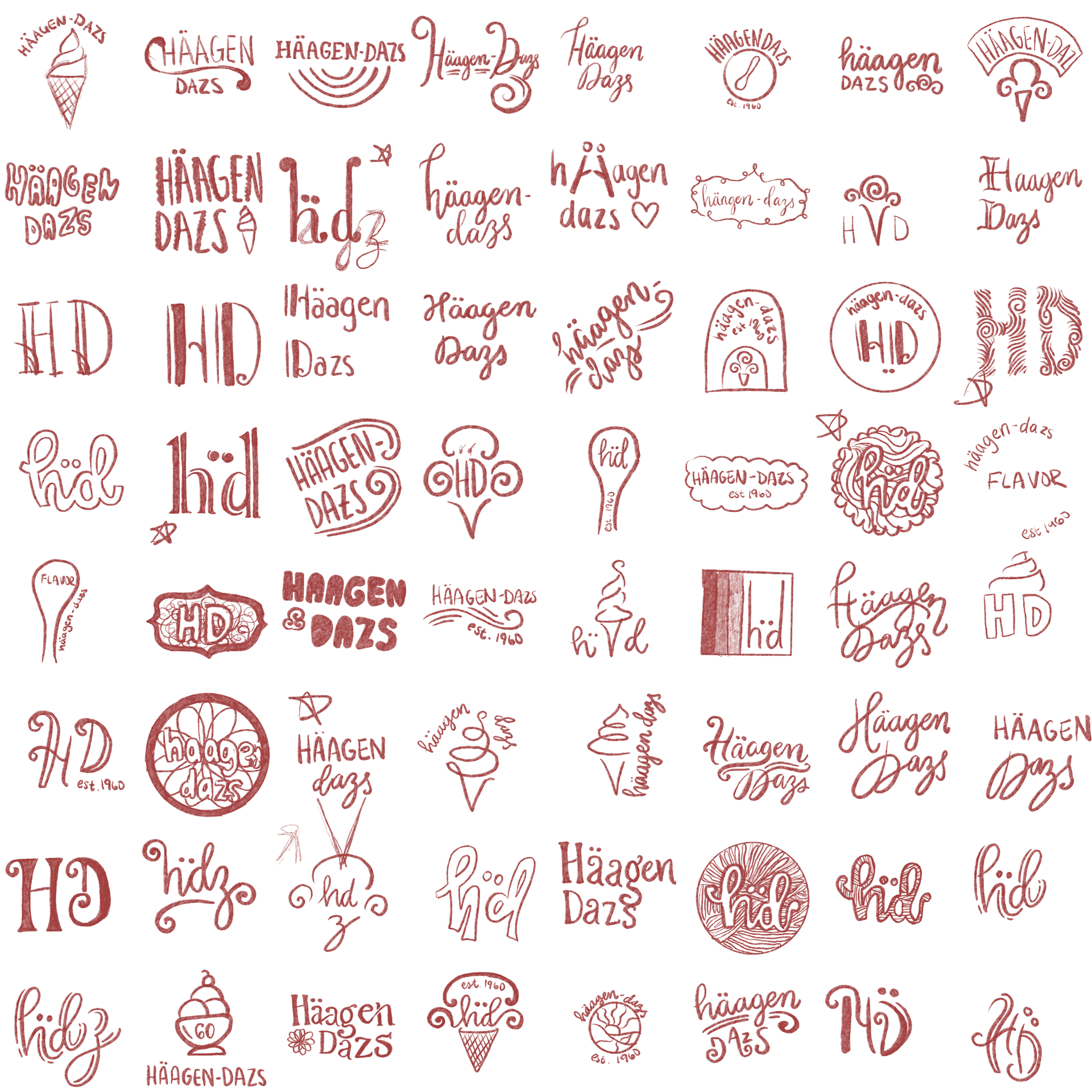

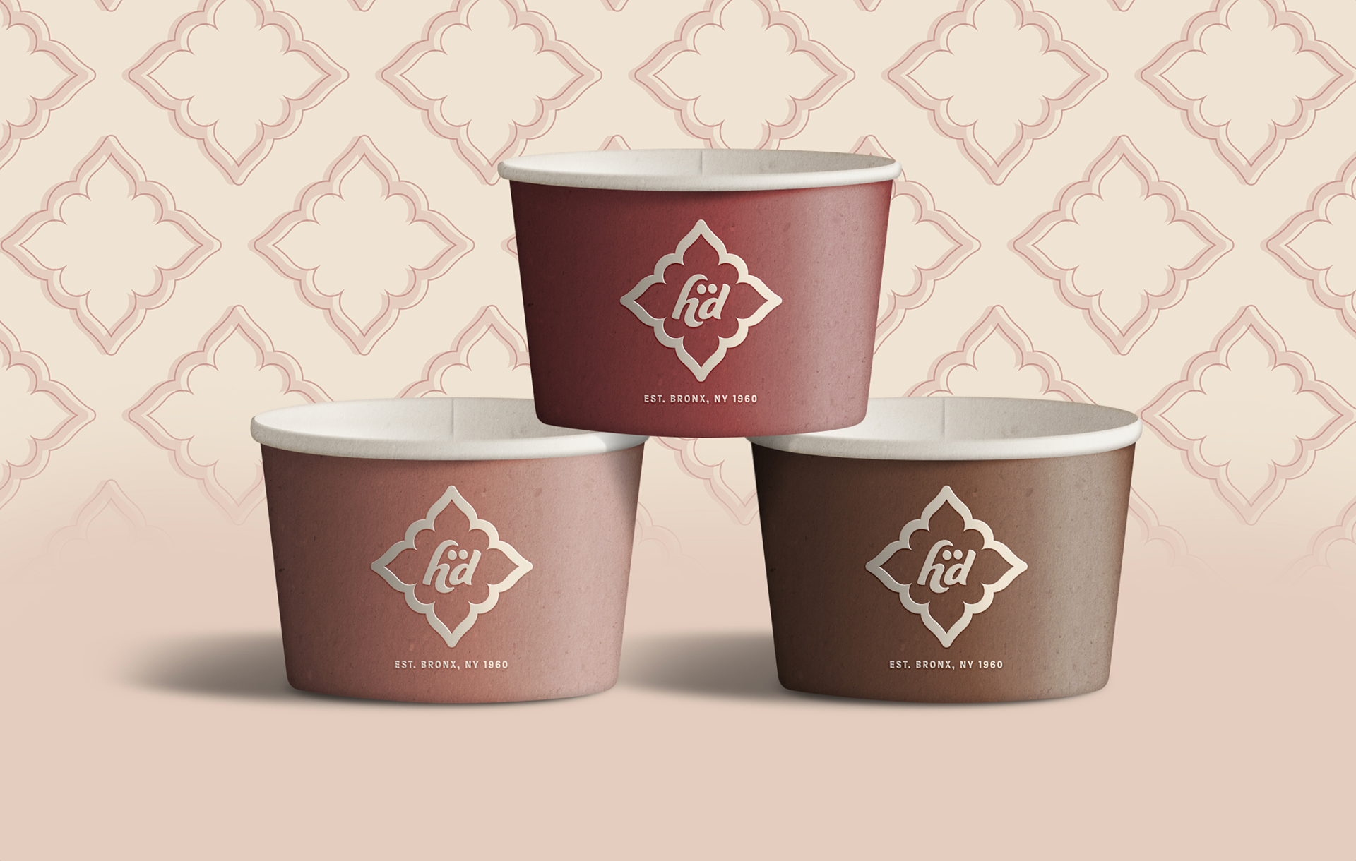
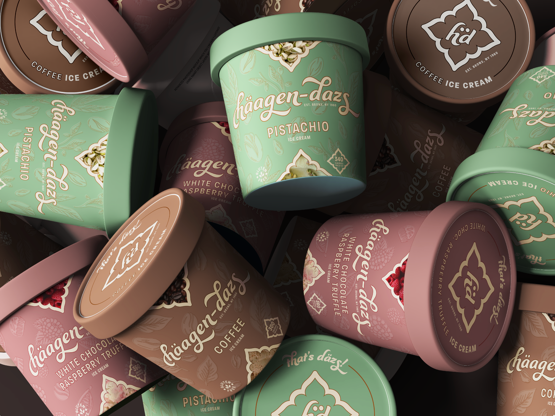
A simple monogrammed secondary logo (right). The four-pointed shape represents the four natural ingredients that make up the base of their quality ice cream: milk, eggs, cream, and sugar.
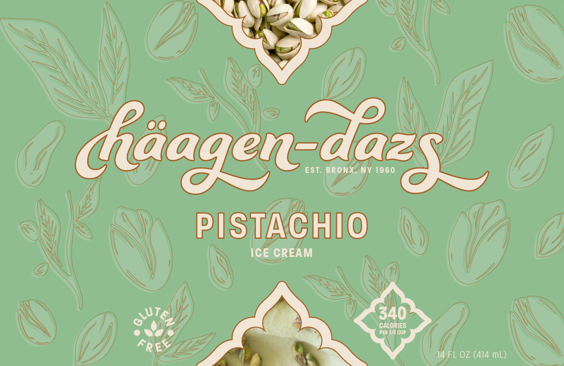
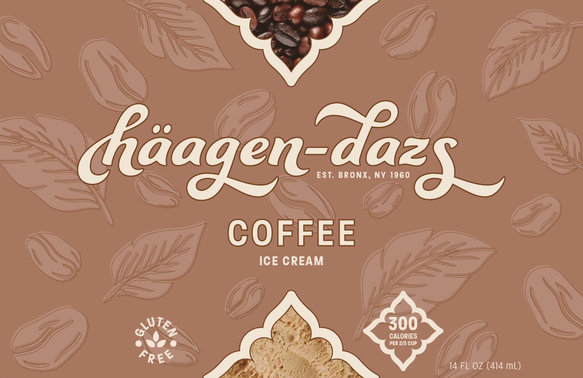
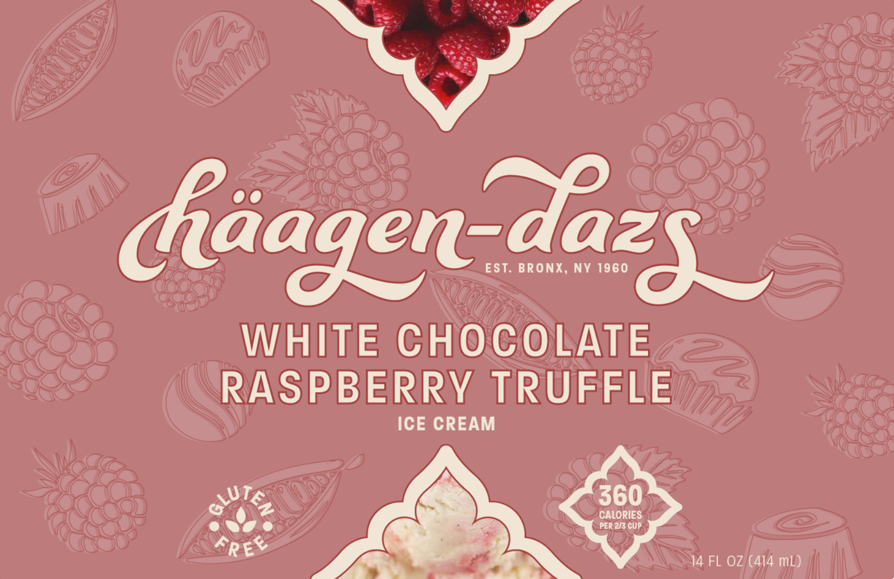
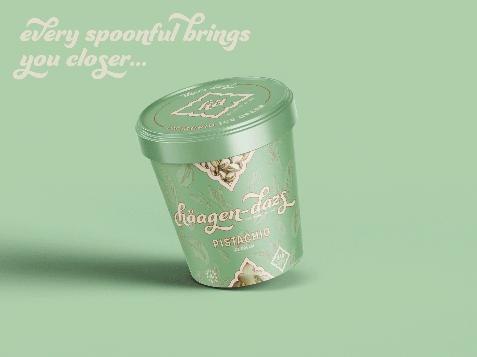
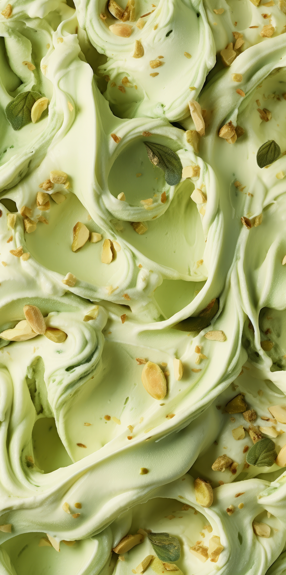
An emphasis of farm to table: this packaging design shows both hand-drawn and image-based elements to, again, showcase Häagen- Daz's use of quality, all-natural ingredients.